Rebar Module System
Overview
Rebar is the site’s system for building pages out of true, modular content blocks (“modules”). It provides the infrastructure for rapid page building from prebuilt blocks that only need content and configuration.
Under the hood (Craft 5): modules used to be powered by the Blockonomicon plugin on top of Craft’s Matrix field. During the Craft 5 upgrade that was replaced with Craft’s native nested entries — but the editor experience is the same: add a module to the Modules field, fill in its content, and adjust its Advanced options. (A future cleanup will further streamline the underlying field handles; it won’t change how you build pages.)
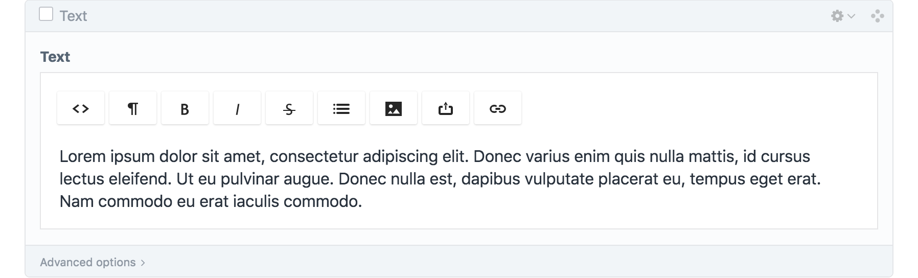 Fig 1: A text module.
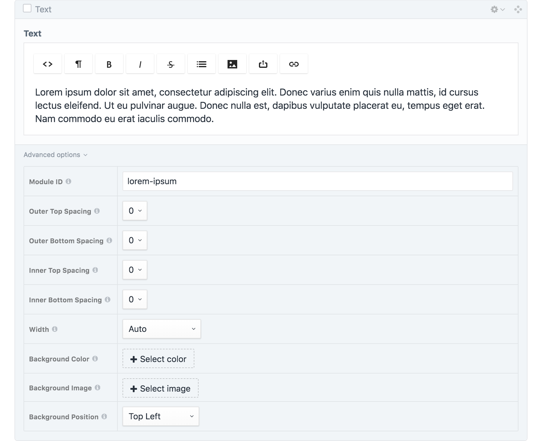 Fig 2: A text module with the “Advanced options” panel expanded.
Module Config Options
Every module includes configuration options that control the styling of the wrapper around its content. These live in the module’s Advanced options panel (see also the “Modules: Advanced Options” page).
Module ID
Unique identifier for linking purposes, written lowercase with hyphens.
A text field for specifying the module’s ID, which is needed in order to link directly to it on the page.
Spacing
Amount of additional top/bottom space outside/inside the module.
A set of four dropdowns for selecting the spacing values (Figs. 3–6).
| Option | Height (rem) | Height (px) |
|---|---|---|
0 | 0rem | 0px |
1 | 0.75rem | 12px |
2 | 1.5rem | 24px |
3 | 3rem | 48px |
4 | 4.5rem | 72px |
5 | 6rem | 96px |
6 | 7.5rem | 120px |
7 | 9rem | 144px |
8 | 10.5rem | 168px |
Outer Top Spacing
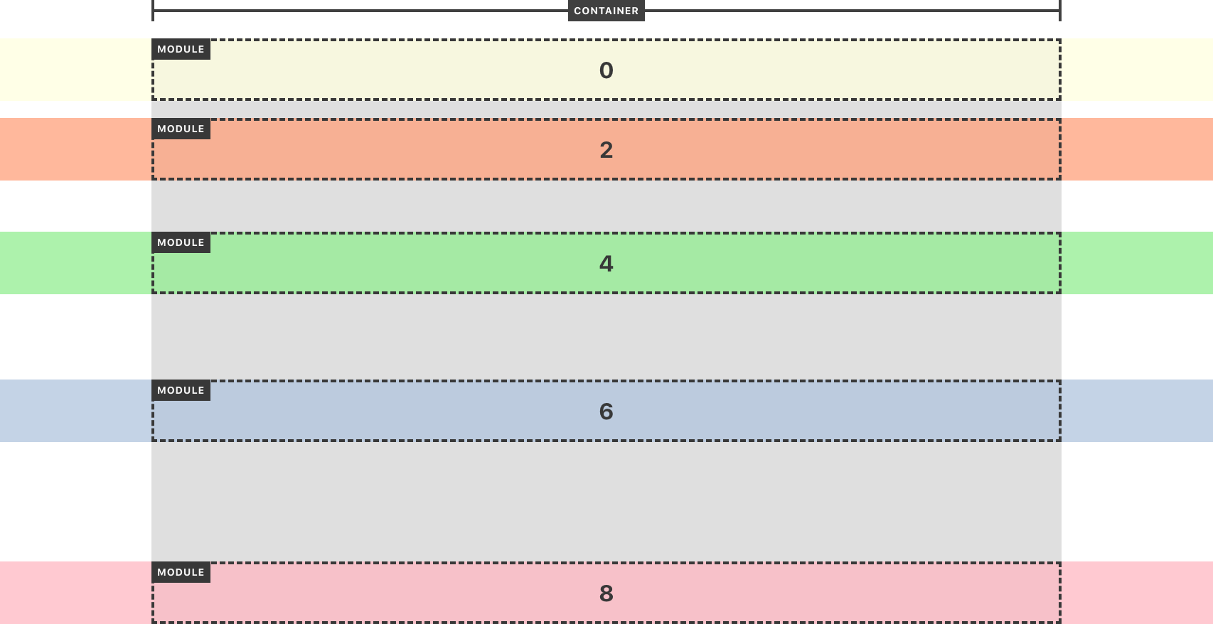 Fig. 3: Spacing applied above the content, outside the bounds of the module.
Outer Bottom Spacing
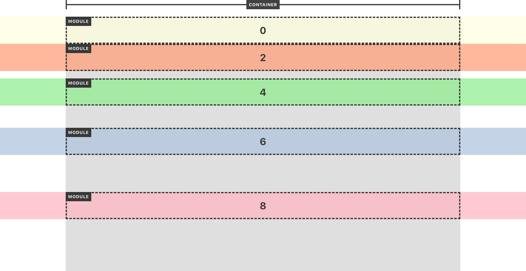 Fig. 4: Spacing applied below the content, outside the bounds of the module.
Inner Top Spacing
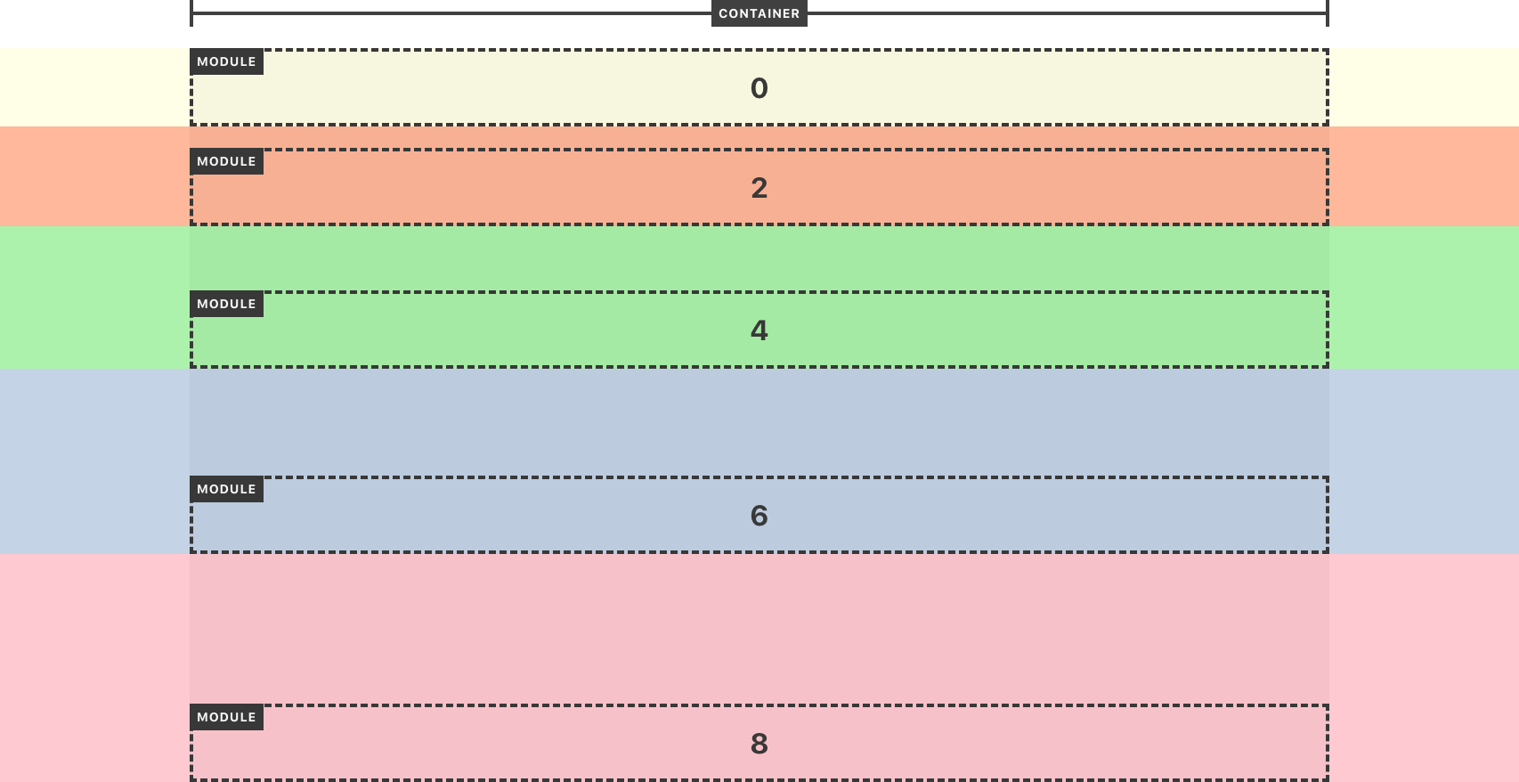 Fig. 5: Spacing applied above the content, within the bounds of the module.
Inner Bottom Spacing
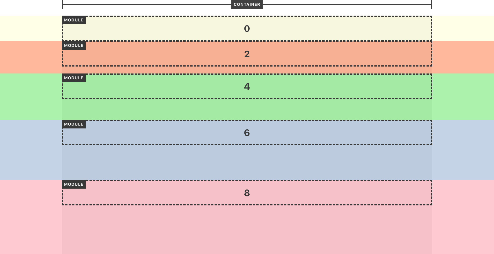 Fig. 6: Spacing applied below the content, within the bounds of the module.
Width
Size of the module relative to the site container.
A dropdown for selecting a width setting (Fig. 7).
| Option | Width |
|---|---|
Auto | Same as site container |
Auto Extended | Same as site container with full-width background |
Slim | Narrower than site container |
Slim Extended | Narrower than site container with full-width background |
Wide | Wider than site container |
Wide Extended | Wider than site container with full-width background |
Full | Full-width |
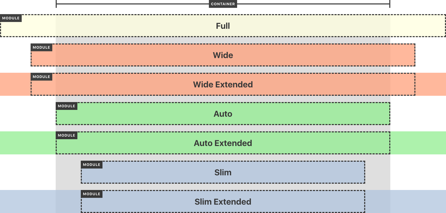 Fig. 7: Example width options.
Background Color
Color displayed underneath the module’s content.
A category field that pulls from a category group called “Background Colors.” Using a category field means colors can be added or removed at any time, and every module automatically gets the latest set of options.
Tip: When assigning a background color, also choose an “Extended” width (Auto Extended, Slim Extended, or Wide Extended) so the background spans the full width of the page.
Background Image
Image displayed underneath the module’s content.
An asset field that allows selecting or uploading any image file.
Background Position
Alignment of the module’s background image (if present).
A dropdown specifying how the background image is positioned/cropped.
| Option | CSS value |
|---|---|
Top Left | top left |
Top Center | top center |
Top Right | top right |
Center Left | center left |
Center Center | center center |
Center Right | center right |
Bottom Left | bottom left |
Bottom Center | bottom center |
Bottom Right | bottom right |